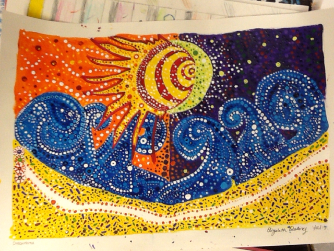
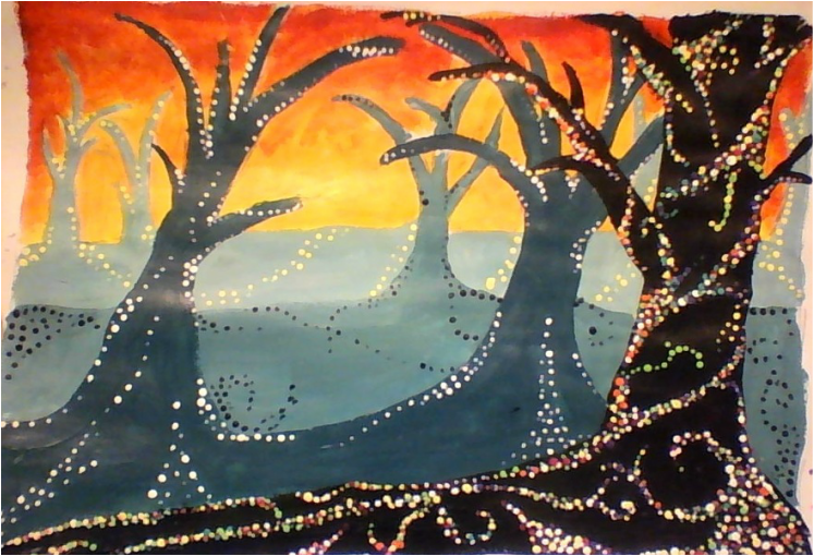
In the process of this painting, I learned how to start painting from the background to the foreground. I used color, value, emphasis and contrast. The trees are different values of green/blue and the background is a mixture of reds, oranges and yellows in order to create a contrast. The feeling of this painting is a little spooky, but with the swirling, colorful dot designs it also has a little bit of fantasy
0 Comments
This is painted with acrylic paints, for a lot of the dots, I used the back of the paint brushes. The main elements and principles used are color, form, movement, and pattern. The colors chosen demonstrate daytime and nighttime. I also chose bright colors which compliment and contrast. The colors are in big areas with smaller patterns made up of dots which create a sense of movement The media used for this is watercolor paints, the subject is a flower. One new skill I learned was how to really layer the paint to make the flower illuminus. I also learned how to use details as well as big color by starting with the big shapes and getting smaller as I go on. Color is one of the main art elements. The colors I mixed were all from the primary colors and therefore they were not dull and had a glow. The colors chosen made the flower look real. Emphasis was also important to consider in this painting. I made a background which makes the foreground pop. In order to do this, I used complementary colors.
This black and white flower drawing is made with a pen and ink. Line is the main art element used in this project, the direction, value and thickness of the lines vary in order to create a sense of form and shape. In the process, I learned how to use a pen and ink. I also learned the importance of deliberate and precise marks.
The medium of this piece is watercolor paints. While creating it, I learned how to make a real looking face, and how to layer colors to make them realistic and sort of glowing. I also learned to use highlights and complimentary colors and how to make a background darker on one side. The main art/design elements employed are color, form and emphasis
In the process of making this linoluem block print, I learned how to make shading without actually changing colors or shades. I learned stippling, hatching, and cross hatching and how to use them to make different shades. Shape, form, and line are all incorporated in order to make the letters look 3D.
This is a watercolor painting of some fall leaves. The leaves are the motif. While working on this painting I learned how to layer colors starting with yellow to make the painting look bright. Also, I got more detail as the colors got darker. Color is one of the art elements in this painting, the colors of the leaves differentiate them from each other and create the feeling autumn.
The triptych is different than my single drawing because it has lines that connect at the edges of the drawing which add emphasis and makes it seem as if they are different aspects of a whole. Our group could have worked better on using the same line darkness and shading consistently to make them go together but overall the group of drawing a gives a different feeling than the single ones. Using a pencil, I created lines of varying value which point towards one vanishing point, creating realistic space. I also shaded in order to give the hallway form, light and make everything look real. Through one point perspective, the drawing is proportional and has very real space. The size and value of the elements of the drawing give the hallway length, width and form. This drawing is made with only pencil. Lines, value, shape and form create space in one point perspective. I used orthagonals and vanishing points to make furniature and I shaded the furniature to create an illusion of some things being in front of others. |